geo109
Geography 109:
Digital Mapping
Mapping 3: Official Data Stories
University of Kentucky
Matthew W. Wilson
In this exercise, you will produce a series of choropleth maps using Social Explorer, an online mapping application that produces simple, attractive maps of US Decennial Census and American Community Survey data. This will require you to fix a critical eye on your own cartographic decision-making, recognizing the active role that aesthetic decisions apparently play in shaping the stories maps tell. You will also develop a basic understanding of data classification methods.
Note: There are 11 steps in this assignment’s instructions, followed by a section on what to submit to Canvas.
Grading.
The assignment is worth 25 points, based on a Word document (or PDF) you will upload to Canvas containing:
- Three maps: two side-by-side comparison maps and one single pane—exported from Social Explorer. These should be exports and not screenshots (15 points).
- Responses to the three questions at the conclusion of the assignment (10 points).
Consult the syllabus schedule for the due date of this assignment. Note: Late submissions will be penalized, as discussed in the syllabus.
Note: This assignment assumes that you are using the University of Kentucky license for Social Explorer. Follow the instructions carefully to ensure that you are utilizing this license.
Instructions.
-
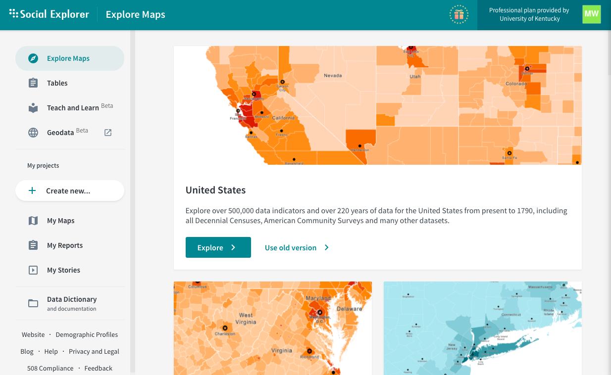
To begin, you will need to create a Social Explorer account and log in. Access Social Explorer through the library (available at this link). Once you’re logged in, double check that the University of Kentucky is noted as the license provider in the top right corner of the Social Explorer website.
-
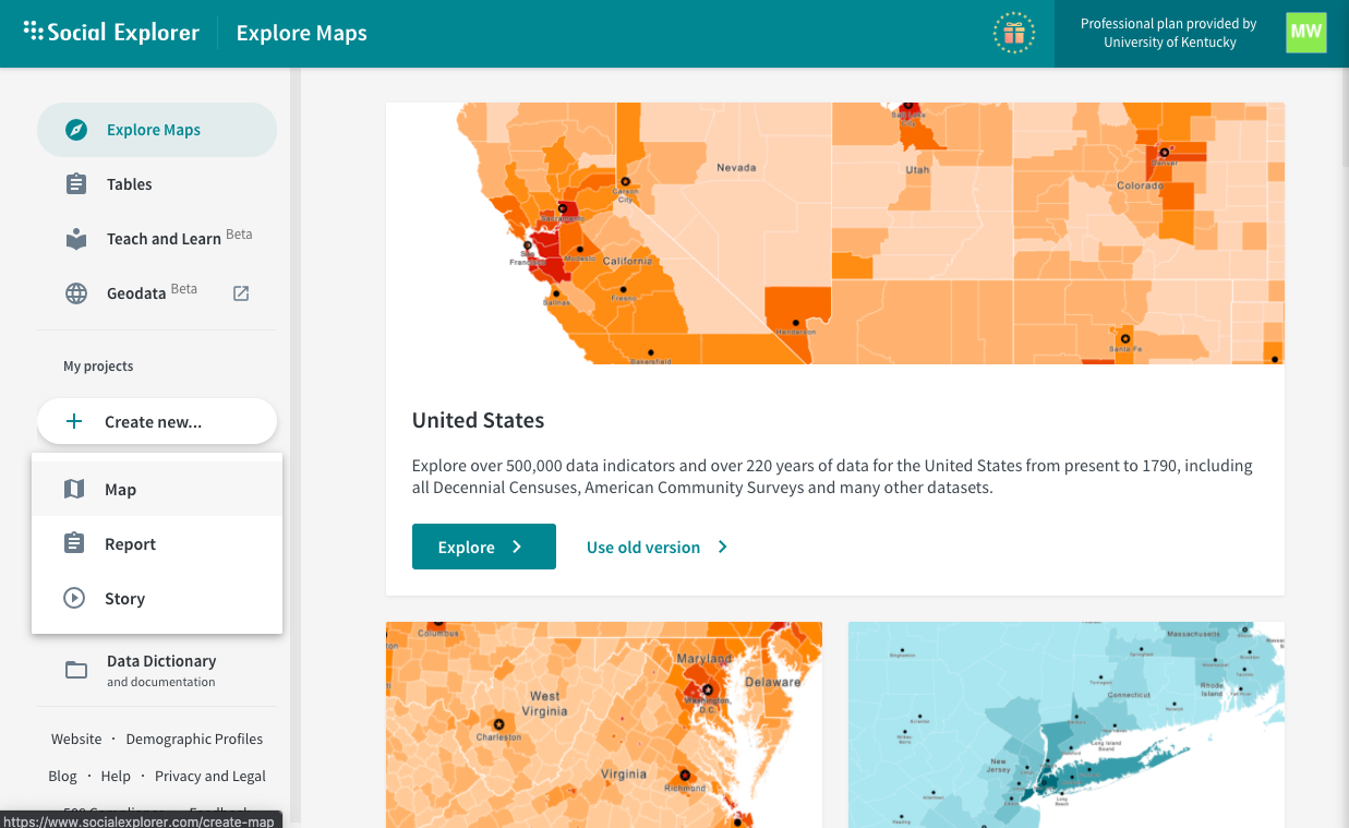
Once you have logged in, click on the “Create new…” button below “My projects”. Then click the Map option from the dropdown. You’ll then give the map a title, “Mapping 3”, and then select the “United States” option.
Social Explorer will then prompt you to either Take a Tour of its interface or Skip it and immediately start mapping. Feel free to take the tour, but the magic starts when you start mapping. -
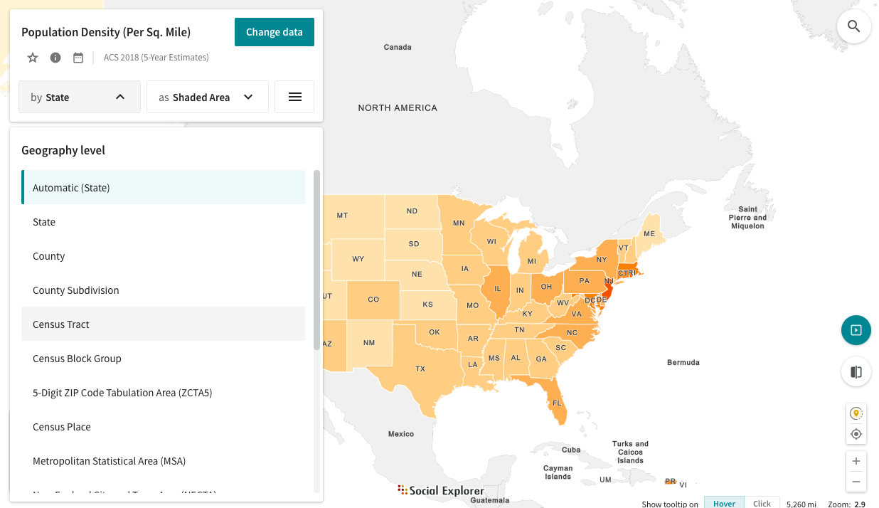
We will now spend some time exploring the interface. Click the By State button to open a drop-down menu where you choose between several data geometries. Select Census Tract.
-
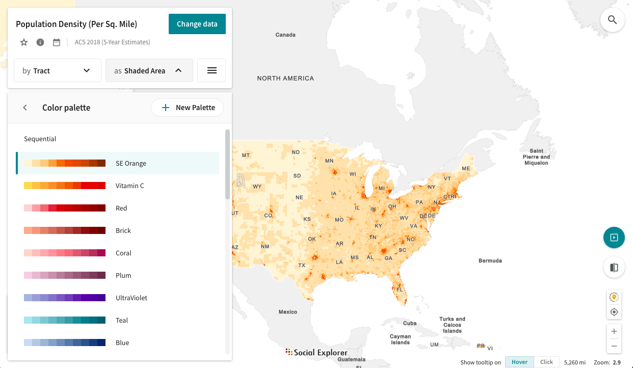
Click the pencil icon in the key at the bottom left corner to edit this visualization select the color ramp to open a menu of color ramp choices. Scroll down and note the differences between Diverging and Sequential color modes here. Explore how these color scale options might affect the story told by your map.
-
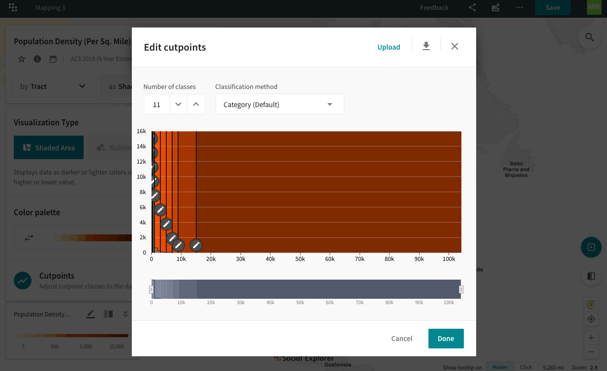
Click on the map to close the visualization menu and then click on the pencil icon again. Instead of clicking on the Color palette, select Cutpoints. From here you can change the data classification model. Note: Here, you can change both the method of data classification and the number of classes into which the data is divided. Explore how these options affect the symbology.
-
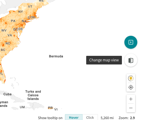
Change the Map View by pressing the button at the right of the screen. Note: You can create Side-by-Side and Swipe maps for easy comparison. Since we will be comparing similar maps in this assignment, we will use the Side-by-Side layout.
-
Click the Export as Image button at the top of the screen. Note that you can download your maps as images (.png) or as zip files at a resolution of your choosing, under the Format menu. Export your maps as PNG images.
-
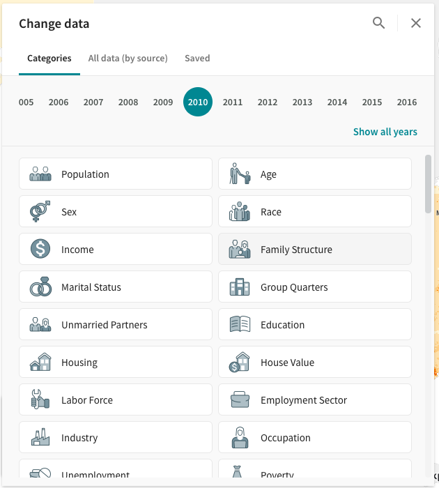
Change the Map Layout back to Single. Click the Change Data tab in the top left hand corner. Note: The variety of data Social Explorer makes available for each year. Think about who produced this data and how it was produced.
-
Select Change Data, set Survey Year to 2010, and select Family Structure.
-
Scroll past the ACS Estimates to data from the most recent decennial census: Census 2010. Keep scrolling, and you will get to Census 2010. Under Census 2010, select Female householder, no husband present from the Households By Presence Of People Under 18 Years By Household Type category. Maps made with this data will depict the distribution of households led by single mothers organized geographically by census tract.
Deliverables.
In what follows, you will be producing different maps that tell very different stories using the same data, illustrating the non-neutrality of cartographic practices. The previous steps provide all of the guidance you will need to complete the assignment, so revisit them as needed.
Note: The maps you prepare for this assignnment should use the Female householder, no husband present data from step 10 at the census tract level and be scaled (zoomed) such that Lexington-Fayette county is featured.
Map 1: Sequential vs. Diverging Color Schemes
-
Select Side-by-Side from the Change Map View icon. On one of the maps, select any Sequential color scheme (EXCEPT for Full Spectar). On the second, select any Diverging color scheme.
-
Export (download) your maps as image files (.png) and place them in your Word document. Label the maps with their respective color schemes.
-
Answer QUESTION ONE in your Word document: Which color scheme is more appropriate for this data and why?
Map 2: Comparing Classification Methods
-
Change both maps back to the default color scheme (SE Orange). Change the data classification method used in each map: in the first map, use equal interval and in the second, quintile.
-
Export (download) your maps as image files (.png) and place them in your Word document. Label the maps with their respective classification schemes.
-
Answer QUESTION TWO: Assume that you are trying to make the case that single parent families are in need of more financial support. Which of these two maps (equal interval or quintile) would you use to make this argument and why?
Map 3: Total Numbers vs. Density
-
Change the map layout back to single pane mode and change the data classification back to Category (Default).
-
Find Census Tracts 3 and 4 in the middle of Fayette County. Note the number of single mothers in each tract, as well as their colors relative to one another.
-
Export (download) your map as an image file (.png) and place it in your Word document.
-
Answer QUESTION THREE: Census Tract 4 is represented with a darker orange than Census Tract 3, but has fewer single mothers. Why is this?